lighterdarkerwarmercoolerbrighterduller
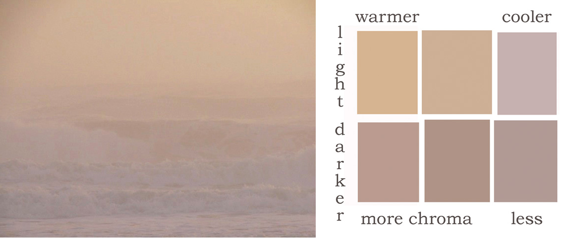
 We talk about color using terms like temperature or hue and saturation or intensity and unless you know what these terms mean you aren't going to know what they look like in the real world. I found this image on the internet that I've been saving for something. I didn't take the picture but I did lift it off of some site. What I like about it is how subtle the values and colors are. The longer you look at it the more you start to see the image emerge.
To show the differences in the colors I've isolated a few notes and dropped them in a chart; light up top, darker down below, more chroma (saturation/intensity) to left, less to the right, warmer on the left and cooler on the right. So you can now put a square face to a name. And to show how little difference in one or two of the three components it takes to separate from its neighbor. When I'm trying to figure out a color I ask myself "lighter darker/warmer cooler/brighter duller" that and a bit of squinting down to see what the difference is between one area and another helps a bunch.